
Every successful business works hard to build a recognizable identity. Logos, signage, marketing materials, and customer experience all play a role. But one element that often gets overlooked is the color of the physical space itself. The walls inside a store, office, or facility become part of the brand story. When those colors are off even slightly, the brand impact is weakened.
Commercial painting is not only about refreshing a space. For many businesses, it is about maintaining a consistent visual identity that customers recognize instantly. Accurate brand color matching ensures that a business looks the same in person as it does online, in advertisements, and across multiple locations.
Color as a Business Asset
Brand colors are chosen with purpose. They evoke emotion, influence mood, and help customers remember a company. Think of how quickly certain colors bring specific brands to mind. When a customer steps into a business, the interior color palette should support that same recognition.
If walls are painted in a shade that is too warm, too cool, or slightly off tone, it changes the atmosphere of the space. That shift can make a brand feel less professional or inconsistent. Professional commercial painters understand that color accuracy is not decorative. It is part of a company’s public image.
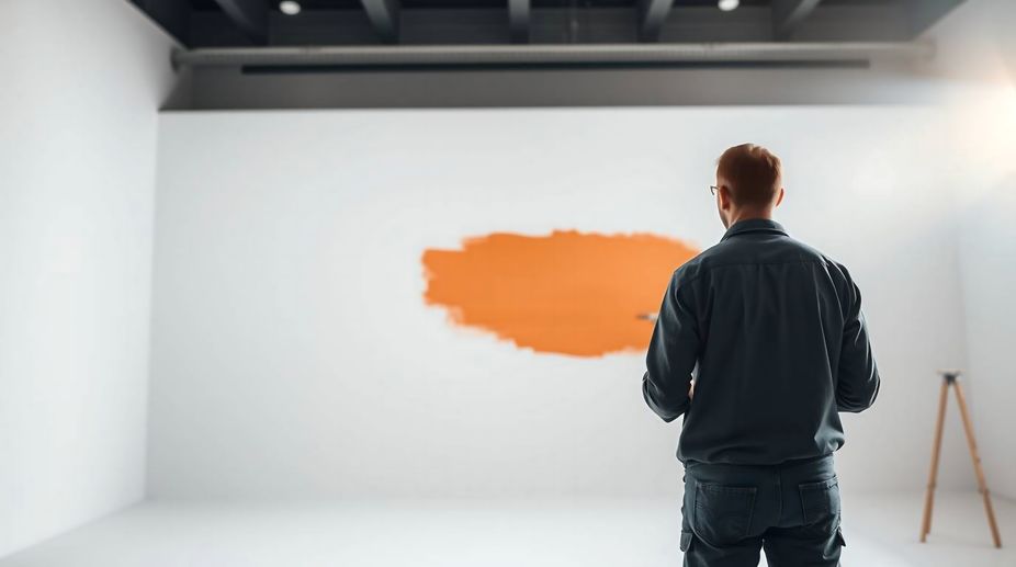
How Professional Color Matching Works
True brand color matching goes far beyond picking a similar swatch from a paint deck. A professional painting team starts by reviewing brand color standards when they exist. Many companies use Pantone or digital color codes for their official materials. These references provide a precise starting point for painting formulation.
Next, paint is custom tinted to match the target color. Samples are applied directly in the space, so they can be viewed under actual lighting conditions. Natural light, artificial light, and surrounding materials all influence how color appears. This testing phase ensures that the result looks correct in real conditions, not just on paper.
Why Surface Prep Affects Color Accuracy
Even the best color match will fail without proper surface preparation. Old paint, uneven textures, or unprimed walls can alter the way color lays and reflects light. Professional painters focus heavily on sanding, cleaning, patching, and priming so that the finished color looks smooth and uniform.
This preparation step is especially important in commercial spaces where walls experience frequent wear. Proper prep helps the brand colors stay vibrant and consistent for years instead of fading or showing uneven coverage.
Sheen and Lighting Make a Difference
Color is only one part of the equation. Paint finish also influences how a brand color is perceived. Matte finishes absorb light and create a softer look. Satin or semi-gloss finishes reflect light and appear brighter. The same color in different finishes can look surprisingly different once applied.
Lighting adds another layer. Retail spaces, offices, restaurants, and warehouses all use different lighting setups. Professional painters consider these conditions when confirming final color selections so that the brand appearance stays true throughout the day and night.
Consistency Across Multiple Business Locations
For companies with more than one location, consistency becomes even more important. A customer who visits two branches should feel like they are in the same brand environment each time. Professional painting companies keep records of paint formulas, finishes, and application methods so future projects match previous work.
This makes expansions, renovations, and touch ups easier while protecting brand consistency long term.
Keeping Business Operations Running Smoothly
Commercial painting projects require careful planning. Work often needs to happen after hours on weekends, or in phases to keep operations moving. Experienced commercial painters coordinate schedules, protect equipment and furnishings, and maintain a clean workspace.
This allows businesses to improve their space without closing doors or disrupting staff and customers.
A Finished Space That Reflects the Brand
When brand color matching is done correctly, the results feel natural and intentional. Customers recognize the space instantly. Employees feel connected to the company environment. The business presents itself with confidence and professionalism.
For commercial properties in Chester County, investing in professional brand color matching ensures that every painted surface supports the identity the business has worked hard to build. It turns a simple painting project into a meaningful upgrade that strengthens the brand for years to come. Contact PA Painting Services at 215-287-0582 today or visit us online for more information!
Leave a Reply